- App Bar’s
//TopAppBar


//BottomAppBar
- Badge
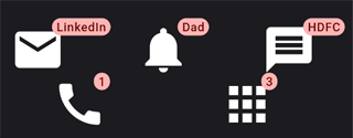
Badge(
    label: Text("LinkedIn"),
    smallSize: 80,
    child: Icon(Icons.mail, size: 50)
),

Badge(
    label: Text("1"),
    smallSize: 80,
    child: Icon(Icons.call, size: 50,)
),- Buttons

List<Widget> toggleIcons = [Icon(Icons.thumb_down), Icon(Icons.thumb_up)];
List<bool> isSelected = [false, false];
List<DropdownMenuItem> dropdownMenuItems = [const DropdownMenuItem(child: Text('Menu Item 1'), value: 1,),const DropdownMenuItem(child: Text('Menu Item 2'), value: 2,)];
List<ButtonSegment> segmentButtonItems = [ButtonSegment(value: 1, label: Text('Home')), ButtonSegment(value: 2, icon: Icon(Icons.home)), ButtonSegment(value: 3, label: Text('About'))];
int selectedMenu = 1;
Set<dynamic> selectedSegment = {1};

BackButton(),
CloseButton(),
DrawerButton(),
DropdownButton(items: dropdownMenuItems, value: selectedMenu, onChanged: (selected) {setState(() { selectedMenu = selected; });}),
ElevatedButton(onPressed: () {}, child: Text('Elevated Button')),
FilledButton(onPressed: () {}, child: Text('Filled Button')),
FilledButton.tonal(onPressed: () {}, child: Text('Filled Button Tonal')),
FloatingActionButton(onPressed: () {}, child: Column(mainAxisSize: MainAxisSize.max, children: [Icon(Icons.add), Text('Floating')])),
IconButton(onPressed: () {}, icon: Icon(Icons.insert_emoticon)),
IconButton.filledTonal(onPressed: () {}, icon: Icon(Icons.home_filled)),
IconButton.outlined(onPressed: () {}, icon: Icon(Icons.mobile_off)),
MaterialButton(onPressed: () {}, child: Text('Material Button')),
OutlinedButton(onPressed: () {}, child: Text('Outlined Button')),
SegmentedButton(
  segments: segmentButtonItems,
  selected: selectedSegment,
  onSelectionChanged: (value) {
    setState(() {
      selectedSegment.clear();
      selectedSegment = value;
    });
  },
  multiSelectionEnabled : false,
  emptySelectionAllowed: false,
  showSelectedIcon: true,
  selectedIcon: const Icon(Icons.thumb_up),
),
TextButton(onPressed: () {}, child: Text('Text Button')),
ToggleButtons(isSelected: isSelected, onPressed: (index) {
  setState(() {
    for(int buttonIndex = 0; buttonIndex < isSelected.length; buttonIndex++) {
      isSelected[buttonIndex] = false;
    }
isSelected[index] = true;});}, children: toggleIcons),- Cards
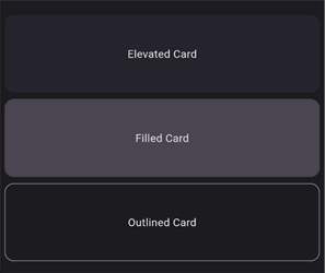
Card(
  child: SizedBox(
    width: 300,
    height: 100,
    child: Center(child: Text('Elevated Card')),
  ),
),

Card(
  elevation: 0,
  color: Theme.of(context).colorScheme.surfaceVariant,
  child: const SizedBox(
    width: 300,
    height: 100,
    child: Center(child: Text('Filled Card')),
  ),
),

Card(
  elevation: 0,
  shape: RoundedRectangleBorder(
    side: BorderSide(
      color: Theme.of(context).colorScheme.outline,
    ),
    borderRadius: const BorderRadius.all(Radius.circular(12)),
  ),
  child: const SizedBox(
    width: 300,
    height: 100,
    child: Center(child: Text('Outlined Card')),
  ),
),- Carousel
- Checkbox
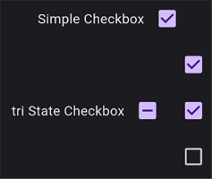
bool checkbox = false;
bool? triStateCheckbox = false;
List<bool> subCheckBoxes = [false, false, false];

void updateParentState() {
  setState(() {
    triStateCheckbox = subCheckBoxes.every((isChecked) => isChecked)
        ? true : subCheckBoxes.every((isChecked) => !isChecked)
        ? false : null;
  });
}

void onParentClick(value) {
  final s = value == true;
  setState(() {
    triStateCheckbox = s;
    subCheckBoxes.fillRange(0, subCheckBoxes.length, s);
  });
}

Checkbox(value: checkbox, onChanged: (isChecked) { setState(() { checkbox = isChecked!;}); }),

Checkbox(tristate: true, value: triStateCheckbox,
  onChanged: (bool? value) {
    onParentClick(value);
  },
),

Checkbox(value: subCheckBoxes[0],
  onChanged: (bool? value) {
    setState(() {
      subCheckBoxes[0] = value!;
      updateParentState();
    });
  },
),

Checkbox(value: subCheckBoxes[1],
  onChanged: (bool? value) {
    setState(() {
      subCheckBoxes[1] = value!;
      updateParentState();
    });
  },
),

Checkbox(value: subCheckBoxes[2],
  onChanged: (bool? value) {
    setState(() {
      subCheckBoxes[2] = value!;
      updateParentState();
    });
  },
),- Chips
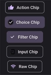
ActionChip(avatar: Icon(actionChipAvatar), label: Text('Action Chip'), onPressed: () {setState(() {actionChip = !actionChip; if(actionChip) {actionChipAvatar = Icons.thumb_up;} else {actionChipAvatar = Icons.thumb_down;}});},),
ChoiceChip(avatar: Icon(choiceChipAvatar), label: Text('Choice Chip'), selected: choiceChip, onSelected: (value) {setState(() {choiceChip = value; if(value) {choiceChipAvatar = Icons.emoji_emotions;} else {choiceChipAvatar = Icons.emoji_emotions_outlined;}});},),
FilterChip(label: Text('Filter Chip'), selected: filterChip, onSelected: (selected) {setState(() {filterChip = selected;});},),
InputChip(avatar: Icon(inputChipAvatar), label: Text('Input Chip'), onPressed: () {setState(() {inputChipAvatar = Icons.mobile_friendly;});},),
RawChip(avatar: Icon(rawChipAvatar), label: Text('Raw Chip'), onPressed: () {setState(() {rawChipAvatar = Icons.wifi;});},),- Date Pickers
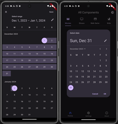
DateTime firstDate = DateTime.parse('1993-05-21');
DateTime lastDate = DateTime.parse('2043-05-21');
DateTime initialDate = DateTime.now();
DateTime selectedDate = DateTime.now();
DateTimeRange selectedDateRange = DateTimeRange(
start: DateTime.now(),
end: DateTime.now().add(Duration(days: 7)),
);
Future<void> _selectDate(BuildContext context) async {
final DateTime? picked = await showDatePicker(
context: context,
initialDate: selectedDate,
firstDate: firstDate,
lastDate: lastDate,
);
if (picked != null && picked != selectedDate) {
setState(() {
selectedDate = picked;
});
}
}
Future<void> _selectDateRange(BuildContext context) async {
final DateTimeRange? picked = await showDateRangePicker(
context: context,
firstDate: firstDate,
lastDate: lastDate,
initialDateRange: selectedDateRange,
);
if (picked != null && picked != selectedDateRange) {
setState(() {
selectedDateRange = picked;
});
}
}
String _ordinal(int day) {
if (day >= 11 && day <= 13) {
return '${day}th';
}
switch (day % 10) {
case 1:
return '${day}st';
case 2:
return '${day}nd';
case 3:
return '${day}rd';
default:
return '${day}th';
}
}
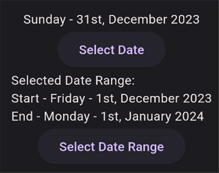
Text(DateFormat('EEEE - \'${_ordinal(selectedDate.day)}\', MMMM y').format(selectedDate)),
ElevatedButton(
onPressed: () => _selectDate(context),
child: const Text('Select Date'),
),
Text(
'Selected Date Range:\n'
+'Start - ${DateFormat('EEEE - \'${_ordinal(selectedDateRange.start.day)}\', MMMM y').format(selectedDateRange.start)}\n'
+'End - ${DateFormat('EEEE - \'${_ordinal(selectedDateRange.end.day)}\', MMMM y').format(selectedDateRange.end)}',
),
ElevatedButton(
onPressed: () => _selectDateRange(context),
child: const Text('Select Date Range'),
),- Dialog’s
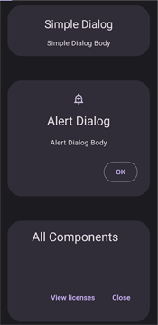
SimpleDialog(title: Text('Simple Dialog', textAlign: TextAlign.center), children: [
  Text('Simple Dialog Body', textAlign: TextAlign.center)
]),

AlertDialog(icon: Icon(Icons.add_alert_outlined), title: Text('Alert Dialog'), content: Text('Alert Dialog Body', textAlign: TextAlign.center), actions: [
  OutlinedButton(onPressed: () {}, child: Text('OK'))
]),

AboutDialog(),- Divider

Text('Some content above divider'),
Divider(),
Text('Some content below divider'),- Lists
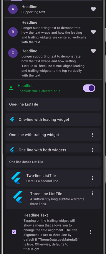
ListView(
  children: [
    ListTile(
      leading: CircleAvatar(child: Text('A')),
      title: Text('Headline'),
      subtitle: Text('Supporting text'),
      trailing: Icon(Icons.favorite_rounded),
    ),
    Divider(height: 0),
    ListTile(
      leading: CircleAvatar(child: Text('B')),
      title: Text('Headline'),
      subtitle: Text(
          'Longer supporting text to demonstrate how the text wraps and how the leading and trailing widgets are centered vertically with the text.'),
      trailing: Icon(Icons.favorite_rounded),
    ),
    Divider(height: 0),
    ListTile(
      leading: CircleAvatar(child: Text('C')),
      title: Text('Headline'),
      subtitle: Text(
          "Longer supporting text to demonstrate how the text wraps and how setting 'ListTile.isThreeLine = true' aligns leading and trailing widgets to the top vertically with the text."),
      trailing: Icon(Icons.favorite_rounded),
      isThreeLine: true,
    ),
    Divider(height: 0),
    ListTile(
      enabled: enabled,
      selected: selected,
      onTap: () {
        setState(() {
          selected = !selected;
        });
      },
      iconColor:
      MaterialStateColor.resolveWith((Set<MaterialState> states) {
        if (states.contains(MaterialState.disabled)) {
          return Colors.red;
        }
        if (states.contains(MaterialState.selected)) {
          return Colors.green;
        }
        return Colors.black;
      }),
      textColor:
      MaterialStateColor.resolveWith((Set<MaterialState> states) {
        if (states.contains(MaterialState.disabled)) {
          return Colors.red;
        }
        if (states.contains(MaterialState.selected)) {
          return Colors.green;
        }
        return Colors.black;
      }),
      leading: const Icon(Icons.person),
      title: const Text('Headline'),
      subtitle: Text('Enabled: $enabled, Selected: $selected'),
      trailing: Switch(
        onChanged: (bool? value) {
          setState(() {
            enabled = value!;
          });
        },
        value: enabled,
      ),
    ),
    Card(child: ListTile(title: Text('One-line ListTile'))),
    Card(
      child: ListTile(
        leading: FlutterLogo(),
        title: Text('One-line with leading widget'),
      ),
    ),
    Card(
      child: ListTile(
        title: Text('One-line with trailing widget'),
        trailing: Icon(Icons.more_vert),
      ),
    ),
    Card(
      child: ListTile(
        leading: FlutterLogo(),
        title: Text('One-line with both widgets'),
        trailing: Icon(Icons.more_vert),
      ),
    ),
    Card(
      child: ListTile(
        title: Text('One-line dense ListTile'),
        dense: true,
      ),
    ),
    Card(
      child: ListTile(
        leading: FlutterLogo(size: 56.0),
        title: Text('Two-line ListTile'),
        subtitle: Text('Here is a second line'),
        trailing: Icon(Icons.more_vert),
      ),
    ),
    Card(
      child: ListTile(
        leading: FlutterLogo(size: 72.0),
        title: Text('Three-line ListTile'),
        subtitle:
        Text('A sufficiently long subtitle warrants three lines.'),
        trailing: Icon(Icons.more_vert),
        isThreeLine: true,
      ),
    ),
    ListTile(
      titleAlignment: ListTileTitleAlignment.center,
      leading: Checkbox(
        value: true,
        onChanged: (bool? value) {},
      ),
      title: const Text('Headline Text'),
      subtitle: const Text(
          'Tapping on the trailing widget will show a menu that allows you to change the title alignment. The title alignment is set to threeLine by default if `ThemeData.useMaterial3` is true. Otherwise, defaults to titleHeight.'),
      trailing: PopupMenuButton<ListTileTitleAlignment>(
        onSelected: (ListTileTitleAlignment? value) {
          setState(() {
            // titleAlignment = value;
          });
        },
        itemBuilder: (BuildContext context) =>
        <PopupMenuEntry<ListTileTitleAlignment>>[
          const PopupMenuItem<ListTileTitleAlignment>(
            value: ListTileTitleAlignment.threeLine,
            child: Text('threeLine'),
          ),
          const PopupMenuItem<ListTileTitleAlignment>(
            value: ListTileTitleAlignment.titleHeight,
            child: Text('titleHeight'),
          ),
          const PopupMenuItem<ListTileTitleAlignment>(
            value: ListTileTitleAlignment.top,
            child: Text('top'),
          ),
          const PopupMenuItem<ListTileTitleAlignment>(
            value: ListTileTitleAlignment.center,
            child: Text('center'),
          ),
          const PopupMenuItem<ListTileTitleAlignment>(
            value: ListTileTitleAlignment.bottom,
            child: Text('bottom'),
          ),
        ],
      ),
    ),
  ],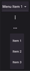
),- Menu
enum SampleItem { item1, item2, item3 }
List<DropdownMenuItem> dropdownMenuItems = [
  const DropdownMenuItem(child: Text('Menu Item 1'), value: 1),
  const DropdownMenuItem(child: Text('Menu Item 2'), value: 2,)];
int selectedMenuValue = 1;
SampleItem? selectedMenuItem;

MenuBar(children: [
  DropdownButton(
      items: dropdownMenuItems,
      value: selectedMenuValue,
      onChanged: (value) {
        setState(() {
          selectedMenuValue = value;
        });
      }),
]),

PopupMenuButton(
    itemBuilder: (BuildContext context) => <PopupMenuEntry>[
          const PopupMenuItem<ListTileTitleAlignment>(
            child: Text('Item 1'),
          ),
          const PopupMenuItem<ListTileTitleAlignment>(
            child: Text('Item 2'),
          ),
        ]),

MenuAnchor(
  builder: (BuildContext context, MenuController controller,
      Widget? child) {
    return IconButton(
      onPressed: () {
        if (controller.isOpen) {
          controller.close();
        } else {
          controller.open();
        }
      },
      icon: const Icon(Icons.more_horiz),
      tooltip: 'Show menu',
    );
  },
  menuChildren: List<MenuItemButton>.generate(
    3,
    (int index) => MenuItemButton(
      onPressed: () => setState(
          () => selectedMenuItem = SampleItem.values[index]),
      child: Text('Item ${index + 1}'),
    ),
  ),
),- Navigation
- Progress indicator
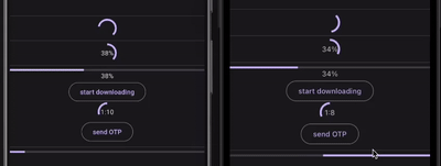
import 'dart:async';
import 'dart:math' as math;

double percent = 0;
double timerValue = 0;
double timer = 100;

void futureWithTheLoop() async {
  while (percent < 1.0) {
    setState(() {
      percent += 0.01;
    });
    await Future.delayed(Duration(seconds: 1));
  }
}

void startTimer() {
  Timer.periodic(Duration(seconds: 1), (timer) {
    setState(() {
      if (this.timer > 0) {
        setState(() {
          timerValue += 0.01;
        });
        this.timer--;
      }
    });
  });
}

CircularProgressIndicator(),

Center(
  child: Stack(alignment: Alignment.center,
    children: [
      CircularProgressIndicator(value: percent),
      Text('${(percent * 100).toInt()}%'),
    ],
  ),
),

LinearProgressIndicator(value: percent),
Text('${(percent * 100).toInt()}%'),

OutlinedButton(onPressed: () {futureWithTheLoop();},child: Text('start downloading')),

Center(
  child: Stack(alignment: Alignment.center,
    children: [
      Transform(alignment: Alignment.center,
        transform: Matrix4.rotationY(math.pi),
        child: CircularProgressIndicator(
          value: timerValue,
        ),
      ),
      Text('${timer ~/ 60}:${(timer % 60).toInt()}'),
    ],
  ),
),

OutlinedButton(onPressed: () {startTimer();}, child: Text('send OTP')),

LinearProgressIndicator(),- Radio button
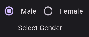
int selectedRadio = 0;
String selectedGender = 'Select Gender';

Radio(
  value: 0,
  groupValue: selectedRadio,
  onChanged: (value) {
    setState(() {
      selectedRadio = value!;
      selectedGender = 'Male';
    });
  },
),

const Text('Male'),

Radio(
  value: 1,
  groupValue: selectedRadio,
  onChanged: (value) {
    setState(() {
      selectedRadio = value!;
      selectedGender = 'Female';
    });
  },
),

const Text('Female')- Search
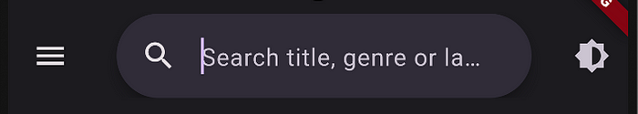
import 'package:flutter/material.dart';

class AppSearch extends StatefulWidget {
  const AppSearch({Key? key}) : super(key: key);

  @override
  _appSearchState createState() => _appSearchState();
}

class _appSearchState extends State<AppSearch> {
  String? selectedColor;
  List<ColorItem> searchHistory = <ColorItem>[];

  Iterable<Widget> getHistoryList(SearchController controller) {
    return searchHistory.map((color) => ListTile(
          leading: CircleAvatar(backgroundColor: color.color),
          title: Text(color.label),
          trailing: IconButton(
              icon: const Icon(Icons.history),
              onPressed: () {
                controller.text = color.label;
                controller.selection =
                    TextSelection.collapsed(offset: controller.text.length);
              }),
          onTap: () {
            controller.closeView(color.label);
            handleSelection(color);
          },
        ));
  }

  Iterable<Widget> getSuggestions(SearchController controller) {
    final String input = controller.value.text;
    return ColorItem.values
        .where((color) => color.label.contains(input))
        .map((filteredColor) => ListTile(
              leading: CircleAvatar(backgroundColor: filteredColor.color),
              title: Text(filteredColor.label),
              trailing: IconButton(
                  icon: Icon(Icons.abc),
                  onPressed: () {
                    // controller.text = filteredColor.label;
                    // controller.selection = TextSelection.collapsed(offset: controller.text.length);
                  }),
              onTap: () {
                controller.closeView(filteredColor.label);
                handleSelection(filteredColor);
              },
            ));
  }

  void handleSelection(ColorItem color) {
    setState(() {
      selectedColor = color.label;
      if (searchHistory.length >= 5) {
        searchHistory.removeLast();
      }
      searchHistory.insert(0, color);
    });
  }

  @override
  Widget build(BuildContext context) {
    return Column(
        children: <Widget>[
          SearchAnchor.bar(
            barHintText: 'Search title, genre or language',
            suggestionsBuilder: (context, controller) {
              if (controller.text.isEmpty) {
                if (searchHistory.isNotEmpty) {
                  return getHistoryList(controller);
                }
                return <Widget>[
                  const Center(
                    child: Text('No search history.',
                        style: TextStyle(color: Colors.grey)),
                  )
                ];
              }
              return getSuggestions(controller);
            },
          ),
        ],
      );
  }
}

enum ColorItem {
  red('red', Colors.red),
  orange('orange', Colors.orange),
  yellow('yellow', Colors.yellow),
  green('green', Colors.green),
  blue('blue', Colors.blue),
  indigo('indigo', Colors.indigo),
  violet('violet', Color(0xFF8F00FF)),
  purple('purple', Colors.purple),
  pink('pink', Colors.pink),
  silver('silver', Color(0xFF808080)),
  gold('gold', Color(0xFFFFD700)),
  beige('beige', Color(0xFFF5F5DC)),
  brown('brown', Colors.brown),
  grey('grey', Colors.grey),
  black('black', Colors.black),
  white('white', Colors.white);

  const ColorItem(this.label, this.color);

  final String label;
  final Color color;
}- Sheets

bool isNonModalBottomSheetOpen = false;

Widget _buildButton(IconData icon, String label) {
  return Column(
    children: [
      IconButton(onPressed: () {}, icon: Icon(icon)),
      const SizedBox(height: 4),
      Text(label),
    ],
  );
}

final List<IconData> buttonList = [Icons.share_outlined, Icons.add, Icons.delete_outline, Icons.archive_outlined, Icons.settings_outlined, Icons.favorite_border];

final List<String> labelList = const ['Share', 'Add to', 'Trash', 'Archive', 'Settings', 'Favorite'];

TextButton(
  child: const Text('Show modal bottom sheet'),
  onPressed: () {
    showModalBottomSheet<void>(
      showDragHandle: true,
      enableDrag: true,
      useSafeArea: true,
      context: context,
      constraints: BoxConstraints(maxWidth: widget.screenWidth),
      builder: (context) {
        return SizedBox(
          height: widget.screenHeight / 8,
          width: widget.screenWidth,
          child: ListView.builder(
            shrinkWrap: true,
            scrollDirection: Axis.horizontal,
            itemCount: buttonList.length,
            itemBuilder: (context, index) => SizedBox(
              width: widget.screenWidth / 6.2,
              child: _buildButton(buttonList[index], labelList[index]),
            ),
          ),
        );
      },
    );
  },
),- Sliders
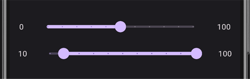
double sliderValue = 30.0;
double rangeStartValue = 0.0;
double rangeEndValue = 1.0;

Row(
  mainAxisAlignment: MainAxisAlignment.spaceEvenly,
  crossAxisAlignment: CrossAxisAlignment.center,
  children: [
    Text('0'),
    Container(
      width: widget.screenWidth-100,
      child: Slider(
        divisions: 10,
        value: sliderValue,
        label: (sliderValue*100).round().toString(),
        onChanged: (value) {
          setState(() {
            sliderValue = value;
          });
        },
      ),
    ),
    Text('100')
  ],
),

Row(
  mainAxisAlignment: MainAxisAlignment.spaceEvenly,
  crossAxisAlignment: CrossAxisAlignment.center,
  children: [
    Text('${(rangeStartValue*100).round()}'),
    Container(
      width: widget.screenWidth-100,
      child: RangeSlider(
          divisions: 10,
          labels: RangeLabels((rangeStartValue*100).round().toString(), (rangeEndValue*100).round().toString()),
          values: RangeValues(rangeStartValue, rangeEndValue),
          onChanged: (value) {
            setState(() {
              rangeStartValue = value.start;
              rangeEndValue = value.end;
            });
          }
      ),
    ),
    Text('${(rangeEndValue*100).round()}'),
  ],
)- Snackbar
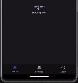
var status = '';
late Timer timer;

void startTimer() {
  timer = Timer.periodic(Duration(seconds: 1), (timer) {
    if (timer.tick == 3) {
      setState(() {
        status = 'SMS sent successfully';
      });
      timer.cancel();
    }
  });
}

TextButton(
  onPressed: () {
    startTimer();
    setState(() {
      status = 'Sending SMS';
    });
    ScaffoldMessenger.of(context).showSnackBar(
      SnackBar(
        behavior: SnackBarBehavior.floating,
        duration: const Duration(seconds: 3),
        width: 400,
        content: const Text('Sending SMS to Deepak'),
        action: SnackBarAction(
          label: 'Stop',
          onPressed: () {
            ScaffoldMessenger.of(context)
                .removeCurrentSnackBar(reason: SnackBarClosedReason.remove);
            timer.cancel();
            setState(() {
              status = 'SMS stopped';
            });
          },
        ),
      ),
    );
  },
  child: const Text('Send SMS'),
),

Text(status),- Switch
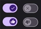
Switch(
    thumbIcon: MaterialStateProperty.resolveWith<Icon?>((states) {
      if (states.contains(MaterialState.selected)) {return const Icon(Icons.check);}
      return const Icon(Icons.close);
    }),
    value: switchValue0,
    onChanged: (value) {setState(() {switchValue0 = value;});}
),

Switch(
    thumbIcon: MaterialStateProperty.resolveWith<Icon?>((states) {
      if (states.contains(MaterialState.selected)) {return const Icon(Icons.thumb_up);}
      return const Icon(Icons.thumb_down);
    }),
    value: switchValue1,
    onChanged: (value) {setState(() {switchValue1 = value;});}
)- Tabs
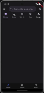
List<Tab> tabItems = [
  Tab(icon: Icon(Icons.movie), text: 'Movies'),
  Tab(icon: Icon(Icons.tv), text: 'Shows'),
  Tab(icon: Icon(Icons.web), text: 'Web Series'),
  Tab(icon: Icon(Icons.child_friendly), text: 'Kids'),
  Tab(icon: Icon(Icons.category), text: 'Categories')
];

DefaultTabController(
  length: 5,
  child: Scaffold(
    appBar: AppBar(
      toolbarHeight: 0,
      bottom: TabBar(
        tabs: tabItems,
      ),
    ),
    body: TabBarView(
      children: [
        Moviestab(),
        Showstab(),
        WebSeriestab(),
        Kidstab(),
        CategoriesTab(),
      ],
    ),
  ),
),- Text fields

final TextEditingController _lastNameController = TextEditingController();
final TextEditingController _firstNameController = TextEditingController();
final TextEditingController _aboutMeController = TextEditingController();
var smallSpacing = 10.0;

Flexible(
  child: SizedBox(
    child: TextField(
      maxLength: 20,
      controller: _firstNameController,
      decoration: InputDecoration(
        prefixIcon: const Icon(Icons.person),
        suffixIcon: _ClearButton(controller: _firstNameController),
        labelText: 'First Name',
        hintText: 'Please enter Firstname',
        helperText: 'Firstname as per Govt ID',
        // errorText: 'error text',
        border: const OutlineInputBorder(),
        filled: true,
      ),
    ),
  ),
),

Flexible(
  child: SizedBox(
    child: TextField(
      maxLength: 10,
      maxLengthEnforcement: MaxLengthEnforcement.none,
      controller: _lastNameController,
      decoration: InputDecoration(
        prefixIcon: const Icon(Icons.person),
        suffixIcon: _ClearButton(controller: _lastNameController),
        labelText: 'Last Name',
        hintText: 'Please enter Lastname',
        helperText: 'Lastname as per Govt ID',
        filled: true,
        // errorText: 'error text',
      ),
    ),
  ),
),

Flexible(
  child: LayoutBuilder(
    builder: (context, constraints) {
      return SizedBox(
        width: constraints.maxWidth,
        child: TextFormField(
          maxLines: null, // Set to null for dynamic multiline
          maxLength: 100,
          controller: _aboutMeController,
          decoration: InputDecoration(
            prefixIcon: const Icon(Icons.info),
            suffixIcon: _ClearButton(controller: _aboutMeController),
            labelText: 'About',
            hintText: 'Tell me about yourself',
            helperText: 'Education, Experience & Skills',
            border: const OutlineInputBorder(),
            filled: true,
          ),
        ),
      );
    },
  ),
)- Time Pickers
//TimePickers- Tooltips
//ToolTipsSource:
https://deepakkaligotla.medium.com/all-material-components-flutter-c3cde12d9e30
0 comments:
Post a Comment