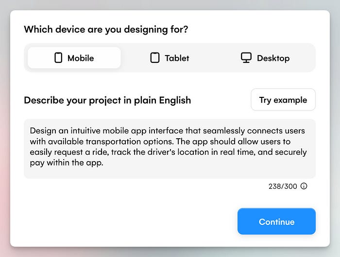
Design an intuitive mobile app interface that seamlessly connects users with available transportation options.
The app should allow users to easily request a ride, track the driver’s location in real time, and securely pay within the app.
Does this idea sound familiar? (Yes, I had Uber in mind while writing.)
I deliberately added some complexity by including multiple features, curious to see if these tools could handle that.
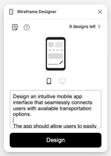
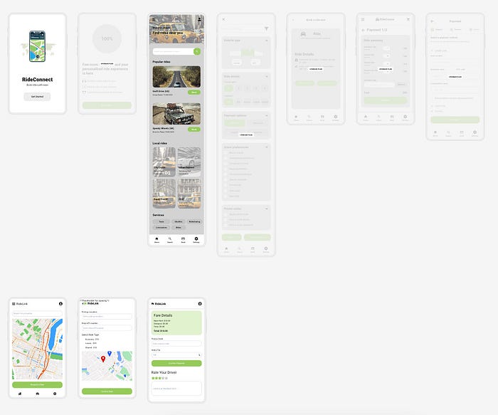
Wireframe Designer
Wireframe Designer is a Figma plugin to generate wireframe designs.
Interface
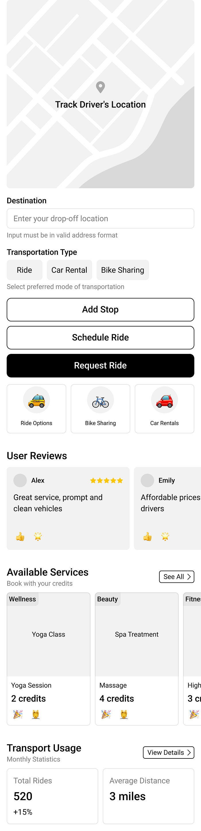
Wireframe
Designer’s interface is minimal. You can select the device type (mobile
or desktop) and generate up to 10 designs on the free plan.
Result
Comment
I
have mixed feelings about Wireframe Designer. It’s a simple,
easy-to-use plugin with a minimalist design. The wireframes have a
particular style. They come neatly grouped with Figma’s Autolayout,
which is easier to edit.
However,
it seems to have a limited knowledge base and sometimes generates
random elements. Depending on your prompt, the results can be hit or
miss.
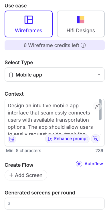
UX Pilot
UX
Pilot claims itself as an AI assistant for UX design, with all UX tools
in one place from discovery to Visual Design. It also offers a Figma
plugin, though with more limitations.
Interface
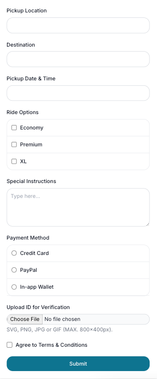
Result
Comment
UX
Pilot offers a lot more features than Wireframe Designer. You can
choose to generate low-fi wireframes or high-fi designs. An inspiring
feature is “Enhance Prompt”, which allows you to refine your prompt for
better results. On the other hand, the free plan comes with limited
functionality.
Uizard
Uizard
positions itself as the world’s first AI-powered UI design tool,
offering a wide range of features specifically focused on UI design.
Interface
Result
Comment
Uizard
feels like a comprehensive tool for creating UI more efficiently,
positioning itself very differently from Wireframe Designer and UX
Pilot.
Regarding
the prompt-to-UI feature, Uizard generates an entire set of designs,
not just a single screen — this is impressive. I haven’t seen other
tools are like this.
Another
innovative feature is the built-in chatbot for making further design
revisions. Uizard also includes a component library with many
plug-and-play elements, which complements its AI-generated designs. In
addition, it offers other features like screenshot to design and
interactive prototyping — all within the platform.
However,
like every tool, it has its downsides — the designs it generates
require additional work and it’s hard to export them for further editing
in Figma. The free plan also has limitations, such as access to only
five screens.
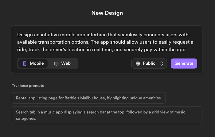
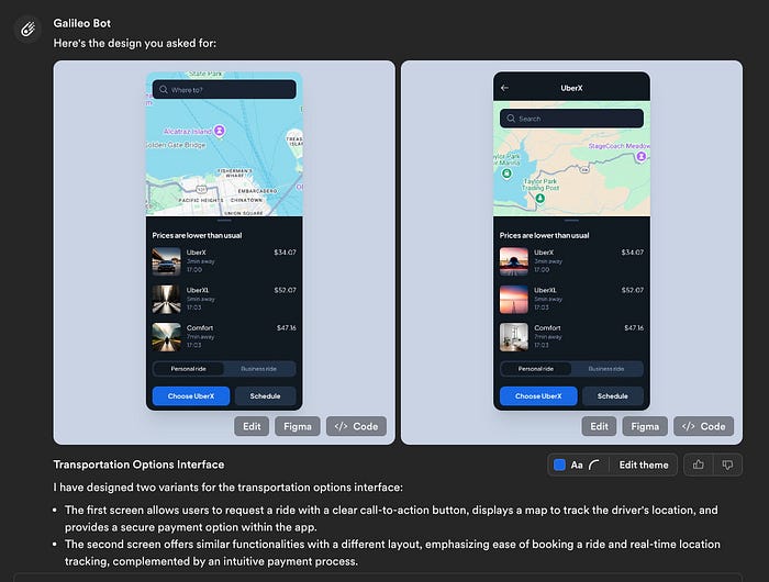
Galileo
Galileo AI is a UI generation platform for high-fidelity designs.
Interface
Result
Comment
Galileo
AI provides two options by default, despite often they are quite
similar. The biggest highlight is the high-fidelity design with
outstanding visual quality.
The
chatbot interface also lets you ask follow-up questions to refine the
design, but the quality of revisions can vary depending on your request.
Another
great feature is that you can easily copy paste the design into Figma
and edit there — life-saver for designers who primarily use Figma.
What
I also enjoy about Galileo AI is the wall of designs generated by other
users. You can see the prompts that they use and even copy the prompt
and revise from there.
Appendix
Earlier
this year, I tested other AI tools as well and shared the experience in
my newsletters. Check them out if you are interested.
2. Main Configuration — The Control Center 🎯 This
is where we set the stage for your app’s presentation. Starting with
the iPhone 13 Pro Max gives your demo a premium feel, while the clean
white background keeps the focus on your app. Think of it as framing
your masterpiece in an art gallery!
3. Tools Configuration — Your Demo’s Swiss Army Knife 🔧 Less
is more! We’ve carefully selected only the essential tools. By hiding
complex options like orientation and keyboard, we’re creating a
distraction-free environment where your app’s features can shine. It’s
like giving a demo with just the right amount of controls — not
overwhelming, but powerful enough to impress.
4. Device List — The Device Zoo 📱 We’ve
curated this list like a fine wine selection! Each device represents a
different user segment, ensuring your app looks fantastic across the
spectrum. From budget-conscious users to premium seekers, you’re
covered. It’s like having a device lab in your browser!
5. Advanced Features — For The Extra Mile ⚡
Want
to showcase your app on a specific device? This is your secret weapon!
Creating custom devices allows you to tailor the preview experience
exactly to your needs. It’s like having a custom-made display case for
your app!
4. App Integration — Bringing It All Together 🔄 This
is where your app gets its preview superpowers! By integrating Device
Preview into your MaterialApp, you’re essentially giving your app the
ability to shape-shift between devices seamlessly. It’s like teaching
your app to speak multiple device languages fluently!
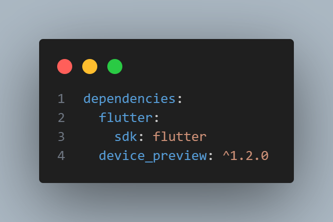
main file
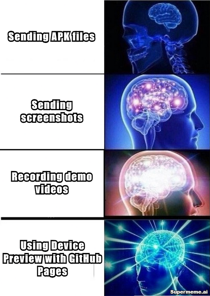
Demo Video
Step 3: Deploy On GitHub Pages 🚀
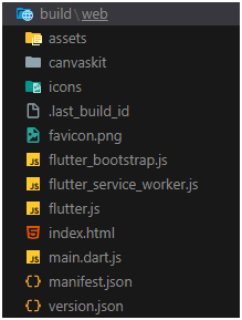
1. Build your web app: Run this Command From your Root of the project
flutter build web
After Running this command You will see Web folder in your build floder
2. Set up docs folder: now run the below commands to move all the content to docs folder
mkdir docs
xcopy /E /H /Y build\web\* docs\
3. Configure GitHub Pages:
Follow the steps shown below
4.The Result: Professional Demo URL 🎯
Your app will be live at:
https://yourusername.github.io/your-repo-name/
Common Issues and Solutions 🔧
Blank Page After Deployment:
<!-- remove this from your web/index.html --> <basehref="$FLUTTER_BASE_HREF">
And make sure to clean and rebuild the project and then move the new build to docs folder by running below commads.
3. Firebase features not working : Make
sure you implement that feature for web also as the device preview just
emulates the device it’s not specifically running the selected OS.
Artificial
Intelligence (AI) has revolutionized the marketing landscape, offering
tools that enhance efficiency, personalization, and scalability.
These
advanced tools are transforming the way marketers work, from automating
challenging tasks to revealing valuable insights. With a plethora of
options available, it’s not easy to figure out the best AI tools for
marketers.
Panic not!
In
this blog post, you’ll discover the top 18 AI tools that are essential
for every marketer. Learn how each tool can help you overcome marketing
obstacles and enhance your overall strategy.
Let’s get started!
Why Should Marketers Use AI Tools?
AI tools offer numerous benefits for marketers, transforming how they operate and compete in the digital world.
These
tools improve productivity by automating repetitive and time-consuming
tasks, allowing marketers to dedicate more time to strategic planning
and creative projects.
They
also improve scalability, ensuring consistent and personalized
communication across multiple platforms and reaching a broader audience
effectively. Moreover, AI tools help solve common marketing challenges,
such as content creation, SEO optimization, and customer engagement.
These
tools are vital components of today’s marketing toolkit, as they offer
data-driven insights and streamline intricate processes. This empowers
marketers to achieve improved results, enhance their campaigns, and
maintain a competitive edge.
AI Content Creation Tools
1. ChatGPT.com
ChatGPT
is a versatile AI tool designed to generate high-quality content,
including blog posts, social media captions, and ad copy. It uses
advanced NLP (Natural Language Processing) technology to create
conversational responses, making it ideal for brainstorming and market
research.
Key Features
Conversational Responses
Generates human-like text, making it perfect for engaging content.
Content Brainstorming
Helps generate ideas and draft content outlines.
Market Research
Provides insights based on user queries and responses.
Personalized Messages
Tailors content to specific audiences and contexts.
Use Case
A
marketing team can use ChatGPT to draft initial versions of blog posts,
saving time on brainstorming and writing. This way, they can focus on
refining and perfecting the content.
2. Jasper.ai
Jasper.ai
specializes in creating engaging marketing copy for various platforms,
from websites to email campaigns. It optimizes content for SEO and
provides real-time data to enhance collaboration among team members. It
also provides a variety of templates and an easy-to-use interface to
simplify content creation and save time.
Key Features
AI Content Creation
Produces high-quality marketing copy tailored to different platforms.
SEO Optimization
Ensures that the content is optimized for search engines to increase its visibility.
Collaboration Tools
Facilitates teamwork with real-time editing and feedback.
Real-Time Data
Provides insights and analytics to refine marketing strategies.
Use Case
A
digital marketing agency can utilize Jasper.ai to quickly generate
SEO-friendly website content, enhancing their client’s search engine
rankings and online presence.
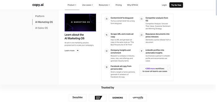
3. Copy.ai
Copy.ai
excels in generating marketing copy for a range of platforms. It offers
workflow templates and an amazing text editor, making it easy to manage
and customize content. This AI tool integrates with popular platforms
like WordPress and Salesforce, allowing for seamless content deployment.
Plus, it suggests improvements to enhance content quality and
effectiveness.
Key Features
Workflow Templates
Pre-designed templates streamline content creation for various formats.
Text Editor
An intuitive editor for easy content customization.
Content Management
Organizes and manages multiple content pieces efficiently.
Email Customization
Creates personalized email content to engage audiences.
Use Case
Marketers
can use Copy.ai to create consistent and engaging email newsletters,
ensuring personalized communication with subscribers.
AI Plagiarism Remover & Optimization Tools
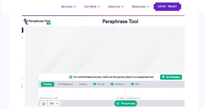
4. Paraphrasetool.ai
Paraphrasetool.ai
is designed to eliminate unintentional plagiarism from your content,
making it unique, engaging, and relatable. This AI tool has a
“Plagiarism Remover” feature that allows you to eliminate the traces of
plagiarism from your content in a single click. The final output retains
the original meaning, giving you peace of mind knowing that your work
is free of plagiarism.
Key Features
Plagiarism Removal
Ensures content originality by paraphrasing existing text.
Content Humanizing
Create Human written & undetectable AI content.
Check Grammar
Check grammatical mistakes and get error-free text.
Summarizes The Text
Provide quick summaries for busy readers.
Use Case
You
can use Paraphrasetool.ai to make your content unique and enhance its
quality, ensuring content remains original and engaging for readers.
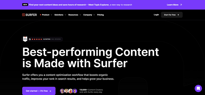
5. SurferSEO
SurferSEO
optimizes your content for search engines while maintaining readability
and an engaging tone. It offers tools for content planning, keyword
analysis, and editing. In addition, this advanced AI tool provides
personalized content recommendations based on top-ranking pages and
identifies content gaps to improve your SEO strategy. Its audit feature
also helps refine existing content to boost search engine rankings.
Key Features
SEO Optimization
Provides data-driven recommendations for improving search engine rankings.
Content Planning
Helps in creating an effective content strategy based on keyword research.
Keyword Analysis
Identifies relevant keywords to target for better visibility.
Content Editor
Analyzes and suggests improvements for existing content.
Use Case
Marketers
can leverage SurferSEO to improve the content on their websites,
resulting in higher search engine rankings and a boost in organic
traffic.
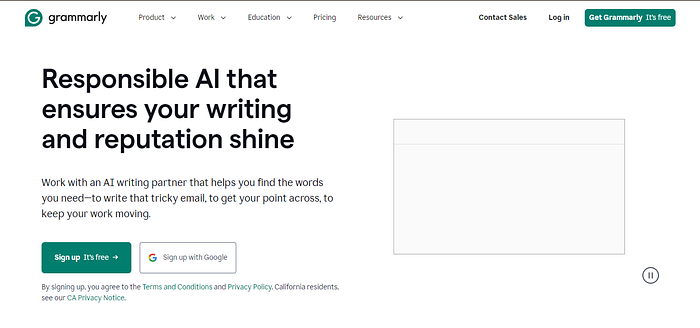
6. Grammarly.com
Grammarly
is a widely used AI tool for improving grammar, clarity, and writing
quality. It provides AI-driven suggestions for style adjustments and
plagiarism detection. Moreover, this online tool helps marketers refine
their tone and conciseness, making it a valuable resource. By
integrating Grammarly into your writing workflow, you can ensure
error-free and effective communication.
Key Features
Grammar Correction
Identifies and corrects grammatical errors in real-time.
Style Suggestions
Provides recommendations for improving writing style.
Plagiarism Detection
Check for unintentional plagiarism so that you remove it.
Tone Adjustment
Ensures the content matches the desired tone and voice.
Use Case
A digital marketer can use Grammarly to polish his drafts, ensuring the final content is error-free, clear, and engaging.
AI Design and Image Generation Tools
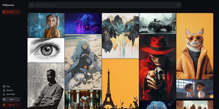
7. Midjourney.com
Midjourney
leverages artificial intelligence to create stunning visuals and
artwork. It’s perfect for generating high-quality images that can
enhance your marketing materials. With its sophisticated algorithms and
simple interface, Midjourney makes it easy to produce unique and
captivating visuals that can elevate your brand’s visual identity.
Key Features
Art Generation
Produces unique and premium-quality digital art.
Design Customization
Allows for creative adjustments and personalizations.
Quality Outputs
Ensures professional-grade visuals are suitable for marketing.
Creative Flexibility
Offers various styles and artistic directions.
Use Case
A social media manager can use Midjourney to create eye-catching graphics for posts, boosting engagement and visual appeal.
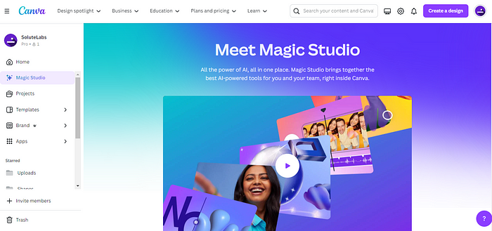
8. Canva.com
Canva
is a design tool that includes AI features to help you create
professional graphics efficiently. You can find numerous templates and
design tools to choose from.With its simple drag-and-drop interface and
AI-generated design recommendations, Canva allows you to produce
impressive visuals quickly.
Key Features
Templates
Provides pre-designed templates for various types of content.
Design Tools
Comes with a wide range of tools to personalize designs.
Collaboration Features
Allows team members to work on designs together.
Image Editing
Offers basic to advanced image editing capabilities.
Use Case
A marketing team can use Canva to quickly produce branded visuals for campaigns, ensuring consistency and professionalism.
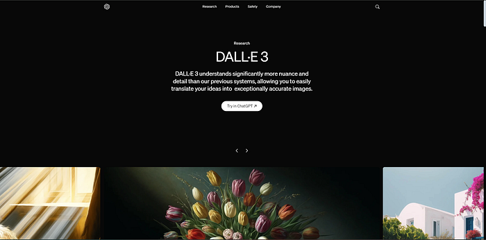
9. DALL E
DALL E
utilizes AI to create top-notch images based on text descriptions.
Thanks to its sophisticated language model and generative features, this
AI tool supports fast prototyping and iteration, empowering users to
bring their ideas to life in a matter of seconds. Moreover, DALL E’s AI
technology ensures that the produced images are visually appealing.
Key Features
Text to Image Generation
Creates images based on written descriptions.
High-Resolution Outputs
Produces detailed and high-quality images.
Creative Flexibility
Offers a wide range of styles and subjects.
Unique Visuals
Generates unique images for distinctive marketing.
Use Case
DALL E allows marketers to generate unique images for blog posts, ensuring visually appealing and original content.
AI Social Media Management Tools
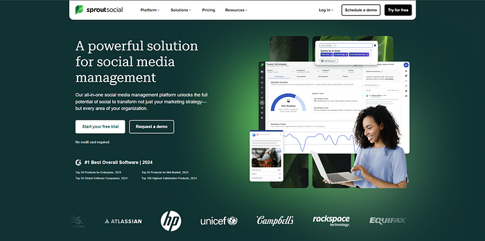
10. Sproutsocial.com
Sprout Social
helps manage your social media presence, analyze performance, and
engage with your audience using AI-powered insights. It streamlines
social media activities through scheduling and analytics. By using this
tool, marketers can enhance their online reputation, improve customer
service, and drive more sales through effective social media management.
Key Features
Social Media Scheduling
Allows for efficient planning and scheduling of posts.
Analytics
Provides detailed insights into social media performance.
Audience Engagement
Tools for interacting with followers and responding to messages.
Content Calendar
Organizes social media activities in a visual calendar.
Use Case
Marketers
can leverage Sprout Social to schedule posts and analyze engagement
metrics, optimizing their social media strategy for better results.
11. Hootsuite.com
Hootsuite
enables you to plan posts, monitor analytics, and handle various social
media accounts with ease. Its advanced AI capabilities help boost your
social media strategies. Thanks to Hootsuite’s intuitive design and
adaptable dashboards, your marketing team can work together effortlessly
and use data to improve your social media impact and interaction.
Key Features
Post Scheduling
Schedule content across various social media platforms.
Social Media Monitoring
Track mentions, keywords, and trends.
Analytics
Measure performance and gain insights into audience behavior.
Team Collaboration
Team members can work together on social media projects.
Use Case
A
marketing agency can use Hootsuite to manage multiple clients’ social
media accounts, ensuring consistent posting and performance tracking.
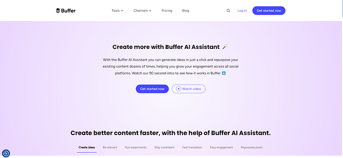
12. Buffer.com
Buffer
is your all-in-one solution for planning, scheduling, and analyzing
social media posts. It offers in-depth performance metrics and audience
insights to enhance your social media strategy. With this AI tool’s
user-friendly tools and flexible scheduling options, you can save time,
increase engagement, and ensure a cohesive brand voice across every
social media platform.
Key Features
Post Scheduling
Plan and schedule posts across different platforms.
Performance Analysis
Detailed metrics and reports on social media performance.
Audience Insights
Understand follower demographics and engagement patterns.
Engagement Tracking
Keep an eye on interactions and reply to comments and messages.
Use Case
You can use Buffer to manage your social media presence like a pro, ensuring timely posts and analyzing what content works best.
AI Customer Service and Support Tools
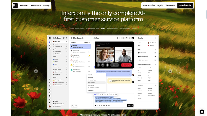
13. Intercom.com
Intercom
uses AI-powered chatbots and messaging tools to deliver personalized
customer support, leading to better user engagement and automated
assistance for improved customer experiences. It also simplifies
communication and builds stronger connections with customers.
Key Features
Chatbots
Automated bots designed to handle common customer inquiries efficiently.
Customer Messaging
Tools for personalized communication with users.
Automated Support
Streamlines customer support processes.
User Engagement
Enhances interaction and engagement with customers.
Use Case
Intercom
provides instant support to customers, improving satisfaction and
reducing response times. It’s a win-win for marketers!
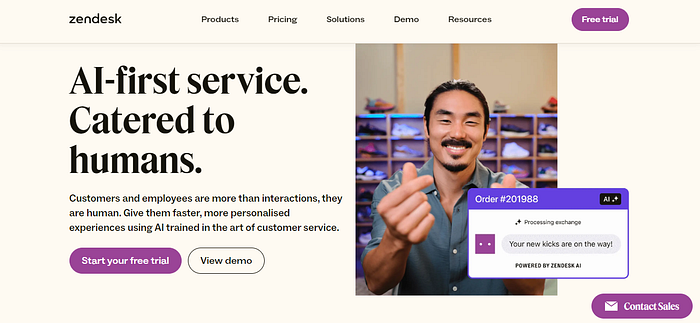
14. Zendesk.com
Zendesk
provides efficient customer support using AI-driven ticket routing,
automation, and self-service capabilities, which makes it ideal for
managing customer inquiries and improving support efficiency.
Key Features
Ticketing System
Manages and organizes customer support tickets in a structured system.
AI Automation
Automates routine support tasks and responses.
Self Service
Provides knowledge bases and FAQs for self-service.
Performance Analytics
Tracks support team performance and customer satisfaction.
Use Case
Zendesk
is a great tool for digital marketers to handle customer support
tickets, making sure that issues are resolved promptly and effectively.
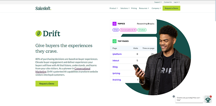
15. Drift
Drift
is a powerful tool for conversational marketing and sales, designed to
engage and convert website visitors in real time. It uses AI to provide a
personalized experience for each visitor, improving customer engagement
and increasing conversion rates.
Key Features
Live Chat
Engage with website visitors instantly through live chat, providing real-time support and answers to their questions.
Chatbot Automation
Implement AI-driven chatbots to manage everyday questions, allowing your team to concentrate on more intricate challenges.
Email Sequencing
Automate follow-up emails based on user interactions, ensuring timely and relevant communication.
Conversational AI
Leverage
AI to create personalized conversations that guide visitors through
their buying journey, enhancing their overall experience.
Use Case
It can be used for lead generation, customer support, sales funnel optimization, and email marketing.
AI Video Editing Tools
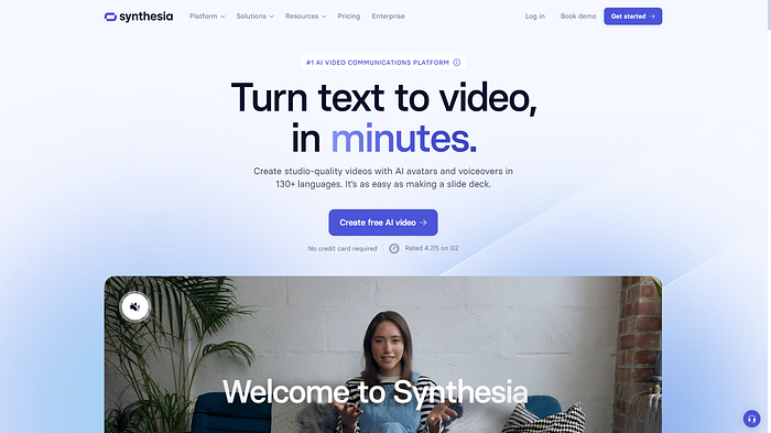
16. Synthesia.io
Synthesia
is a cutting-edge video editing tool powered by AI, making it easy for
you to produce high-quality video content with ease. It is particularly
useful for creating training videos, marketing content, and personalized
video messages.
Key Features
AI Video Creation
Generates high-quality videos using AI without the need for expensive equipment or extensive video editing skills.
Text-to-Speech
Transforms
written content into smooth, natural speech across various languages,
ensuring your videos reach and engage a worldwide audience.
Multilingual Support
Crafts immersive videos in different languages to cater to diverse audiences, enhancing your reach and engagement.
Easy Editing
Uses
a user-friendly interface to edit videos quickly and efficiently,
allowing you to focus on your content rather than the technical details.
Use Case
Using Synthesia, you can create engaging product demonstration videos to showcase features and benefits.
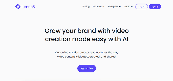
17. Lumen5.com
Lumen5
transforms text content into engaging video summaries, making it an
excellent tool for marketers looking to repurpose their written content
into dynamic visual formats. This tool leverages AI to automate video
creation, making the process quick and easy.
Key Features
Video Creation
Automatically generate videos from blog posts, articles, or any other text content, saving you time and effort.
Media Library
Access a vast library of stock images, video clips, and music tracks to enhance your videos and make them more appealing.
Automated Storyboarding
Use AI to create a storyboard that matches your text, ensuring a coherent and engaging video narrative.
Customization Options
Customize your videos with your brand’s colors, fonts, and logo, maintaining brand consistency across all your content.
Use Case
Utilize this online tool to transform blog posts and articles into captivating video content for social media.
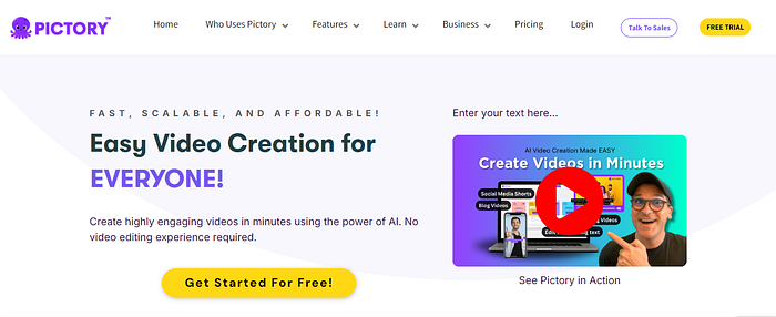
18. Pictory.ai
Pictory
is an AI-powered video generation tool that helps you create short,
branded videos from long-form content. It is ideal for marketers looking
to create engaging video snippets for social media, websites, and other
digital platforms.
Key Features
AI Video Generation
Use
AI to automatically generate videos from long-form content, such as
webinars, podcasts, and articles, highlighting the key points.
Script to video
Turn your written scripts into visually stimulating videos, enhancing the engagement and accessibility of your content.
Transcription
Easily
transcribe audio and video content automatically, simplifying the
process of adding subtitles and enhancing accessibility.
Text-to-Video
Transform text into video content, enhancing your ability to communicate complex ideas through visual storytelling.
Use Case
Marketers
can use it to create short video snippets from longer content to share
on social media. This helps in enhancing marketing campaigns &
reaching a wider audience.
Conclusion
AI
tools are changing the marketing industry by providing solutions that
improve efficiency, personalization, and data-driven decision-making.
The top 18 AI tools in this blog post cover content creation, design,
customer support, and analytics, giving marketers the resources to
succeed in today’s competitive environment.
Using
these tools will not only make your marketing efforts more efficient
but also open up new opportunities for growth and innovation.