Wednesday, November 6, 2024

4 AI tools to generate UI from the same prompt

The prompt I used

Design an intuitive mobile app interface that seamlessly connects users with available transportation options.

The app should allow users to easily request a ride, track the driver’s location in real time, and securely pay within the app.

Does this idea sound familiar? (Yes, I had Uber in mind while writing.)

I deliberately added some complexity by including multiple features, curious to see if these tools could handle that.

Wireframe Designer

Wireframe Designer is a Figma plugin to generate wireframe designs.

Interface
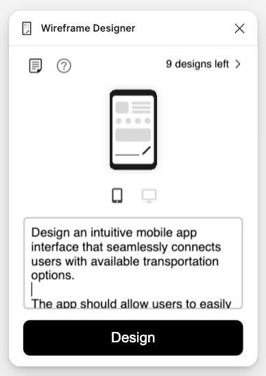
Wireframe Designer’s interface is minimal. You can select the device type (mobile or desktop) and generate up to 10 designs on the free plan.

Result

Comment

I have mixed feelings about Wireframe Designer. It’s a simple, easy-to-use plugin with a minimalist design. The wireframes have a particular style. They come neatly grouped with Figma’s Autolayout, which is easier to edit.

However, it seems to have a limited knowledge base and sometimes generates random elements. Depending on your prompt, the results can be hit or miss.

UX Pilot

UX Pilot claims itself as an AI assistant for UX design, with all UX tools in one place from discovery to Visual Design. It also offers a Figma plugin, though with more limitations.

Interface
Result
Comment

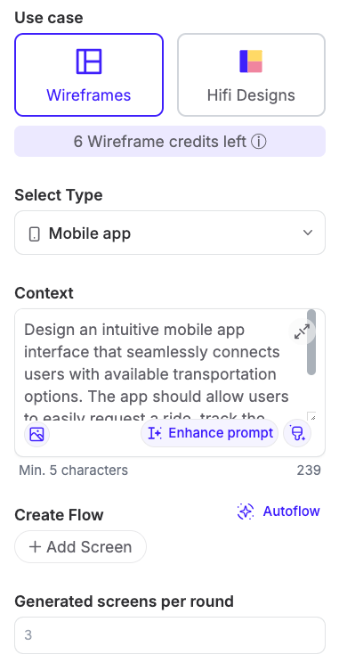
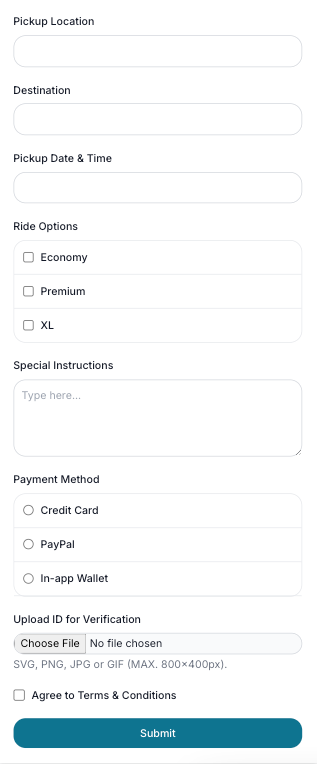
UX Pilot offers a lot more features than Wireframe Designer. You can choose to generate low-fi wireframes or high-fi designs. An inspiring feature is “Enhance Prompt”, which allows you to refine your prompt for better results. On the other hand, the free plan comes with limited functionality.

Uizard

Uizard positions itself as the world’s first AI-powered UI design tool, offering a wide range of features specifically focused on UI design.

Interface
Result
Comment

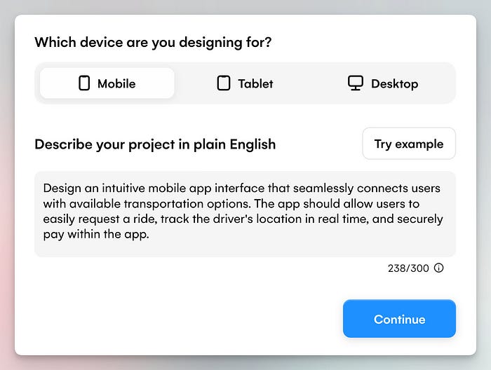
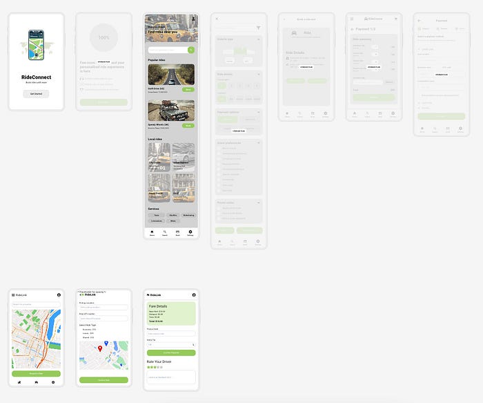
Uizard feels like a comprehensive tool for creating UI more efficiently, positioning itself very differently from Wireframe Designer and UX Pilot.

Regarding the prompt-to-UI feature, Uizard generates an entire set of designs, not just a single screen — this is impressive. I haven’t seen other tools are like this.

Another innovative feature is the built-in chatbot for making further design revisions. Uizard also includes a component library with many plug-and-play elements, which complements its AI-generated designs. In addition, it offers other features like screenshot to design and interactive prototyping — all within the platform.

However, like every tool, it has its downsides — the designs it generates require additional work and it’s hard to export them for further editing in Figma. The free plan also has limitations, such as access to only five screens.

Galileo

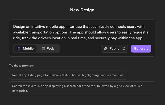
Galileo AI is a UI generation platform for high-fidelity designs.

Interface
Result
Comment

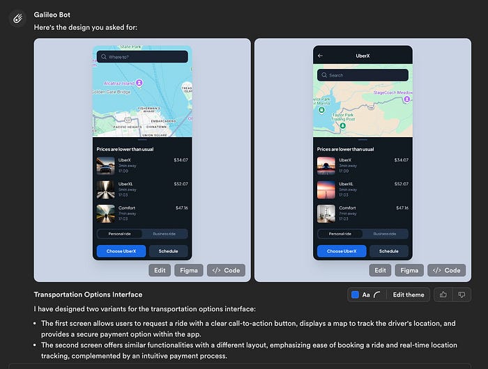
Galileo AI provides two options by default, despite often they are quite similar. The biggest highlight is the high-fidelity design with outstanding visual quality.

The chatbot interface also lets you ask follow-up questions to refine the design, but the quality of revisions can vary depending on your request.

Another great feature is that you can easily copy paste the design into Figma and edit there — life-saver for designers who primarily use Figma.

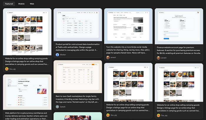
What I also enjoy about Galileo AI is the wall of designs generated by other users. You can see the prompts that they use and even copy the prompt and revise from there.
Appendix

Earlier this year, I tested other AI tools as well and shared the experience in my newsletters. Check them out if you are interested.


Source:

https://medium.com/@xinranma/i-tested-4-ai-tools-to-generate-ui-from-the-same-prompt-0d2113736cce 


Monday, November 4, 2024

How to Deploy Flutter Mobile Apps as Instant Web Preview


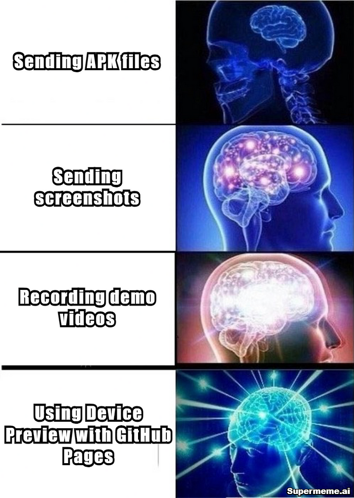
Here’s the hard truth: Every time you send an APK, you’re:

  • Asking busy recruiters to break their workflow
  • Expecting clients to trust unknown software
  • Adding friction to your portfolio review
  • Looking less professional than competitors with instant demos

But what if there was a way to turn your Flutter app into a professional, instantly accessible web preview that works right in their browser? 🤔

Let me show you how Device Preview and GitHub Pages can transform your app demos from “Sorry, can’t install that” to “Wow, this looks impressive!”

The Solution:

Let’s transform your Flutter app into a professional web demo in 3 simple steps:

Step 1: Add Device Preview and Configure🚀

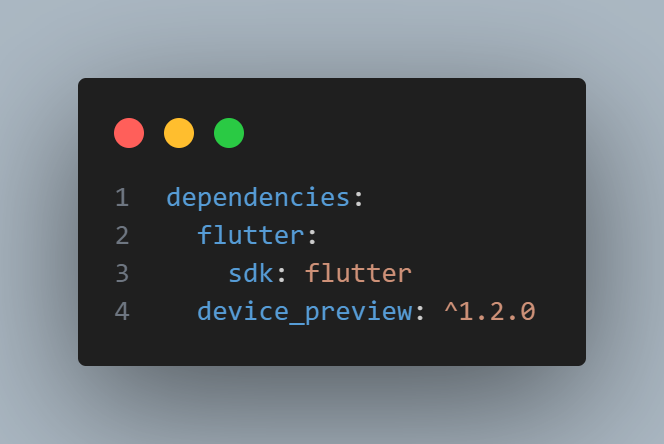
  1. Add Device preview Package to your pubspec.yaml
pubspec.yaml

Pro-Tip: This gives your app superpowers like:

  • Live device switching (iPhone, Pixel, tablets)
  • Orientation flipping
  • Dark/Light mode toggle
  • Different screen sizes preview

2. Main Configuration — The Control Center 🎯
This is where we set the stage for your app’s presentation. Starting with the iPhone 13 Pro Max gives your demo a premium feel, while the clean white background keeps the focus on your app. Think of it as framing your masterpiece in an art gallery!

3. Tools Configuration — Your Demo’s Swiss Army Knife 🔧
Less is more! We’ve carefully selected only the essential tools. By hiding complex options like orientation and keyboard, we’re creating a distraction-free environment where your app’s features can shine. It’s like giving a demo with just the right amount of controls — not overwhelming, but powerful enough to impress.

4. Device List — The Device Zoo 📱
We’ve curated this list like a fine wine selection! Each device represents a different user segment, ensuring your app looks fantastic across the spectrum. From budget-conscious users to premium seekers, you’re covered. It’s like having a device lab in your browser!

5. Advanced Features — For The Extra Mile ⚡

Want to showcase your app on a specific device? This is your secret weapon! Creating custom devices allows you to tailor the preview experience exactly to your needs. It’s like having a custom-made display case for your app!

4. App Integration — Bringing It All Together 🔄
This is where your app gets its preview superpowers! By integrating Device Preview into your MaterialApp, you’re essentially giving your app the ability to shape-shift between devices seamlessly. It’s like teaching your app to speak multiple device languages fluently!

main file
Demo Video

Step 3: Deploy On GitHub Pages 🚀

1. Build your web app:
Run this Command From your Root of the project

flutter build web

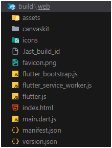
After Running this command You will see Web folder in your build floder

2. Set up docs folder:
now run the below commands to move all the content to docs folder

mkdir docs
xcopy /E /H /Y build\web\* docs\

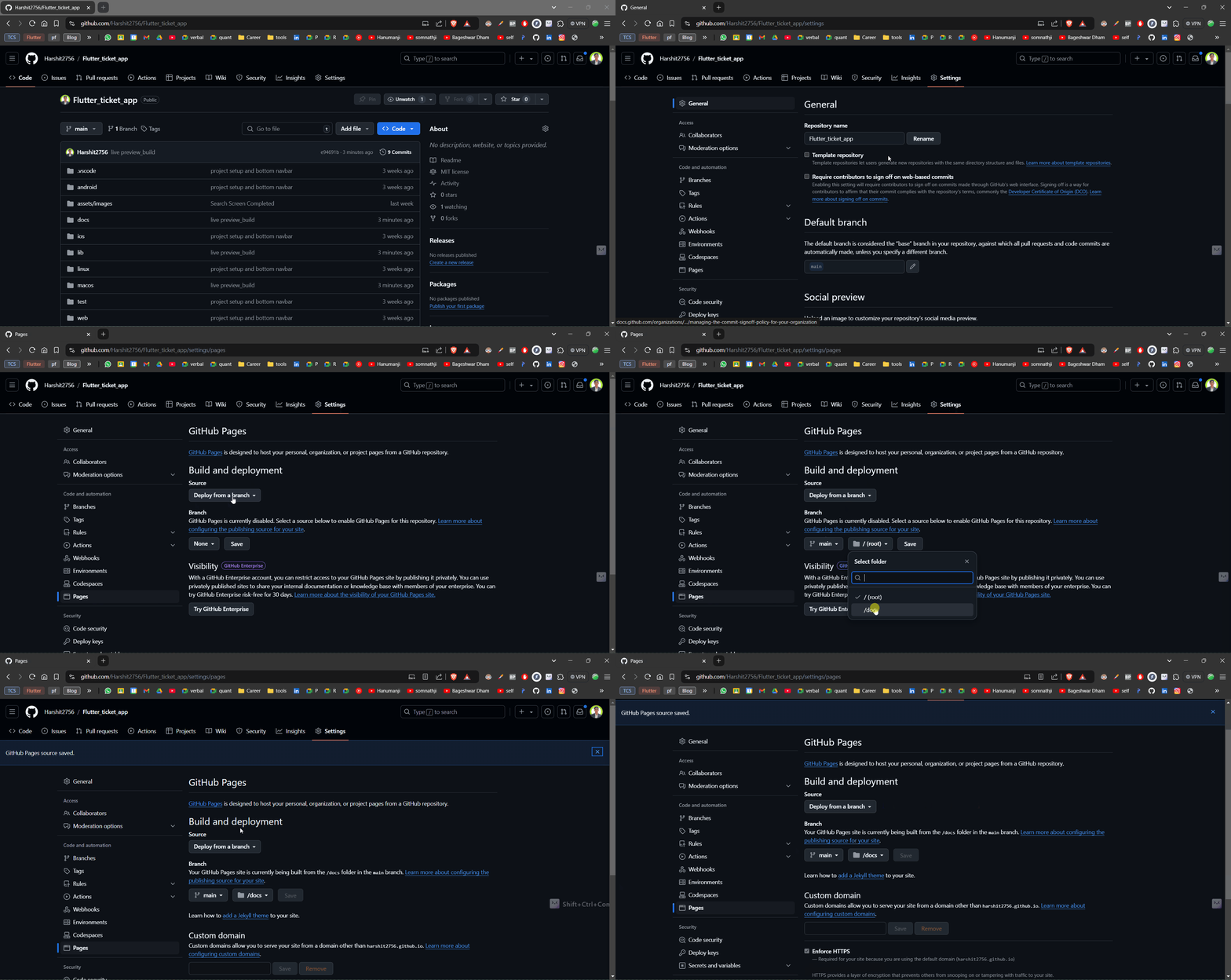
3. Configure GitHub Pages:

Follow the steps shown below

4.The Result: Professional Demo URL 🎯

Your app will be live at:

https://yourusername.github.io/your-repo-name/

Common Issues and Solutions 🔧

  1. Blank Page After Deployment:
<!-- remove this from your web/index.html -->
<base href="$FLUTTER_BASE_HREF">

And make sure to clean and rebuild the project and then move the new build to docs folder by running below commads.

flutter clean
flutter build web
xcopy /E /H /Y build\web\* docs\

2. Assets Not Loading:

# Update in pubspec.yaml
assets:
- assets/

3. Firebase features not working :
Make sure you implement that feature for web also as the device preview just emulates the device it’s not specifically running the selected OS.


Source:

https://medium.com/@khandelwalharshit431/skip-the-apk-how-to-deploy-flutter-mobile-apps-as-instant-web-preview-724ce3b1f502