What is Flutter UI design?
Flutter UI Design is the graphical and interactive components of a Flutter application. These components include layouts, colours, widgets, typography, and animation effects.
Flutter UI includes many UI widgets that can be customised to create visually attractive and responsive user interfaces. It also includes many animation and gesture graphics capabilities that can be used to improve the interactivity and aesthetic appeal of the UI.
Incorporate Material Design Principles
Flutter is designed to use Google’s Material Design language, which is a popular design language for mobile apps. As such, designers who are familiar with Material Design will find it easy to create beautiful and intuitive interfaces using Flutter.
Material Design emphasizes the use of realistic surfaces, such as sheets of paper or layers of ink, to create a tactile and intuitive UI. You have the flexibility to select color roles for surfaces and surface containers. These roles are independent of elevation and allow you to define containment areas according to your preferences. For example, modals and expanded navigation menus are commonly used to represent distinct units of information.
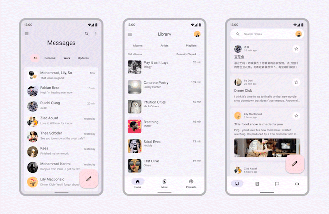
Utilize the Material components that Flutter design offers, such as app bars, cards, bottom navigation bars, and buttons, to make your UI design stand out.
- Material Design promotes the use of bold and deliberate typography to create hierarchy and focus. Clear typography with appropriate font sizes, weights, and spacing helps users quickly understand the content.
- Material Design encourages the use of vibrant and bold colors to provide visual interest and convey meaning. Colors are used to communicate states, actions, and emotions.
- Consistent Iconography: Material Design provides a set of consistent and recognizable icons that can be used to convey actions, objects, and concepts. Icons follow specific guidelines regarding size, shape, and metaphor. For example, a trash can icon to represent deleting an item or a plus symbol to indicate adding a new item.
- Material Design employs meaningful motion to create smooth transitions and interactions that enhance the user experience. Transitions can guide the user’s attention and provide feedback. For example, a fade-in animation when revealing new content or a ripple effect when a button is pressed.
Pay attention to colours
Colours can arouse emotions and set the tone for your UI design. Flutter’s vast colour palette contains nearly every colour on the colour wheel. Mix and match these colours to create a palette that reflects your application’s or brand’s personality. Your UI design can benefit from the depth and dimension that gradients and shadows can give.
Use typography
Typography is essential to user interface design. It can effectively communicate information and establish a visual hierarchy. With Flutter, you can completely personalise the app’s UI typography. To apply various styles to text elements, including headings, subheadings, body text, and captions in Flutter, use the TextStyle class.
Use custom widgets
Flutter’s custom widgets are a potent tool for building UI components tailored to your requirements. You can reuse custom widgets you create to maintain a unified UI design across your application. Create unique, customizable, and reusable widgets with Flutter’s design features.
Use animations
Animations are often used to engage users quickly. An enormous selection of animation widgets is available in Flutter design. You have many options, including AnimatedContainer, AnimatedOpacity, and AnimatedPadding.
These widgets allow you to make slick, undetectable animations that improve user experience. The AnimationController class can make more intricate animations like keyframes and transition animations.
Make Responsive Design
One of Flutter’s standout features is its ability to support responsive design. UX/UI designers can effortlessly create apps that adapt to different screen sizes and resolutions. This flexibility allows for a visually consistent and captivating user experience, regardless of whether the app is accessed on a smartphone or tablet. By harnessing Flutter’s responsive design capabilities, designers can ensure their apps look exceptional and deliver optimal usability on any device.
Consistency in design
Users can navigate your application more simply and understand how it works when the UI is consistent. Using the same font styles, design components, and colours throughout your application will help you show consistency in your UI design. To set a consistent navigation experience, you can also use widgets like BottomNavigationBar and Drawer.
Here are some key features of Material Theme Builder:
- Theme Creation: With Material Theme Builder, you can easily create and manage themes for your designs. It allows you to define primary and secondary colors, typography styles, and shape styles that align with Material Design guidelines.
- Color Palette Management: The plugin provides tools to manage and customize your color palette. You can select primary and secondary colors, adjust their shades and tints, and preview how the colors will look in your design.
- Typography Customization: Material Theme Builder offers options to customize typography styles. You can define font families, sizes, weights, and other typographic properties, ensuring consistency throughout your design.
- Shape Styles: The plugin enables you to create and manage shape styles for buttons, cards, and other components. You can define corner radii, elevation levels, and other properties to ensure a consistent visual style across your design.
- Component Library: Material Theme Builder integrates with Figma’s component system, allowing you to create a library of Material Design components. These components can be easily reused and shared across different designs and projects.
Flutter UI designing best practices
These practices will enable you to offer an engaging and scalable app user experience regardless of the niche while maximising the framework’s capabilities in Flutter app development. Here, we briefly mention these practices.
- As often as feasible, use stateless widgets. They are easy to test and manage because they are straightforward and have fewer adverse effects.
- Keep widgets compact and reusable to increase code modularity and reduce duplication. It is possible to employ composition and inheritance to maximise widget reuse.
- Use the widget tree to handle the state. Flutter offers a widget tree to manage the state of your app, which keeps your code organised and straightforward to understand.
- The Business Logic Component (BLoC) pattern can divide business logic and view levels. In the end, this makes code testing and maintenance simpler.
- Use as few third-party packages as are necessary for your app.
- Use the dart analyze command line tool to make your code more readable and consistent. The Dart analyzer evaluates your code for common mistakes and formatting difficulties.
- You can keep your app responsive and lightweight by using lazy-loading for lists, limiting the number of widgets, and avoiding complex computations on the UI thread.
- Poor coding often ruins a positive user experience. To boost your app’s efficiency, eliminate extraneous loops, swap literals for constants, and create as few objects as possible.
- Use async and await to increase responsiveness and prevent stopping the UI thread. It’s crucial to provide smooth interactions free of performance issues.
The best practices for creating flutter apps listed above can all contribute to ensuring your app is productive, successful, and user-friendly.
Conclusion
Finally, Flutter UI designs are essential to developing high-performance, cross-platform mobile applications with the Flutter framework. Flutter offers a variety of customizable widgets and tools for creating responsive, visually appealing, and engaging user interfaces for mobile applications.
Using these tools and design principles, developers may create intuitive, visually appealing, and highly performant mobile applications, making them a favorite choice among mobile app developers.
So, if you’re a UX/UI designer looking to expand your horizons and create stunning cross-platform designs, embracing Flutter’s design capabilities is the way to go. Let Flutter empower you to craft engaging and user-friendly interfaces that leave a lasting impression on your users.
Source:
https://medium.com/@mdrahamat0505/flutter-ui-design-essential-guidelines-for-stunning-app-interfaces-505555377804
0 comments:
Post a Comment